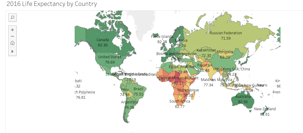
Ever wanted a quick and easy way to make a map for one of your business presentations without having to contact someone from IT?
Have you wished for a free tool and accompanying method that could be easily learned in a few minutes and applied to your presentation at no cost?
Need this map to be interactive?
Well my friends the method and tool exists. It’s called Tableau. Guess what? You can do all the above with The online version of the software and it’s FREE!
You can download it Here
Let’s get to it.
If you don’t already have Tableau. You can visit www.tableau.com and download the free application to your computer. Tableau is a great tool that is easy to use with big data. Once installed you can proceed with the following easy 10 steps.
Perhaps you already have data you can use to practice with. Perhaps not. If you do not already have a data set and would like to practice please visit https://www.data.gov/ for free data sets from the government.
Step 1.
Prepare the data. Data preparation is the most important step and is usually at least 80% of the work. Ensure there are no blank cells and that your data is configured in a table format with rows and columns only and 0 nulls.

Step 2.
Connect to the data source.
The Tableau online version allows you to connect to a wide variety of file types. Microsoft Excel, text only files, and Microsoft Access to name a few.
You can even connect to a server.

Step 3.
Check to make sure your data transitioned to the tableau interface properly.

Step 4.
Go to your worksheet.

Step 5.
Notice Tableau has separated your data into “Dimensions” and “Measures.”

Step 6.
Select “City” (CTRL & left click ) then drag it directly on top of its parent dimension “ST” for state.
Step 7.
Name and create your hierarchy. When you see the pop up box illustrated below – go ahead and name your hierarchy as you see fit and select “OK” to create it.


Step 8.
Change Hierarchy to the correct category by left clicking “Abc” and select “geographic role” then change to “State”

Step 9.
Drag “State” into your Tableau pane then do the same for “City”
Tableau will automatically begin calculating the latitude and longitude. It will generate a map for you.


Step 10.
Add in additional detail


Tableau is a powerful tool for data analysis and there are many opportunities to create great visualizations with the tool. This ten step guide introduces you to the power of Tableau for creation of maps.
Let me know what you think. Drop a comment and thanks for your time!
